Modern Wedding Invitation Design Ideas
Wedding invitations have come a long way from the rigidly traditional: engraved script on ivory cardstock with a tissue sheet. Today's couples want invitations that feel like them — and for many, that means design that's clean, bold, and unmistakably current. Modern invitations aren't a single look; they're a design attitude: uncluttered, typography-driven, and personal.
Whether you're going fully digital or printing a beautifully minimal suite, these modern invitation design ideas will help your stationery feel fresh, intentional, and exactly like you.
What Makes an Invitation "Modern"?
Modern invitation design is defined by what it removes and what it emphasizes:
Typography as the hero. Where traditional invitations lead with ornament and script, modern ones lead with type. Big, confident typefaces — sometimes enormous — carry the design. The names, the date, the venue are set with intention and space.
Minimal decoration. No borders, no fussy flourishes, no stacked inserts. Modern invitations use whitespace as the design element. One color accent, one strong image, one typographic idea.
Honest materials. Modern stationery favors texture and quality over embellishment: thick cotton paper, letterpress texture, recycled cardstock, visible grain. The material is the decoration.
Clean information hierarchy. Date, time, venue, RSVP — each piece of information has a clear place and weight. Modern invitations are as much about clarity as beauty; guests can read them in seconds.
A personal voice. Modern wording ditches the formula ("request the honour of your presence") for something closer to how you actually talk. The invitation sounds like the couple, not like a rulebook.
Typography: The Engine of Modern Design
Modern invitations are built around type choices. The reliable patterns:
The oversized sans-serif. A clean, geometric or grotesque sans-serif set large — the names or even just the date dominating the card. Think of gallery posters and album covers. This is the most reliably modern look, and it photographs beautifully.
The modern serif pairing. A contemporary serif — one with sharp, fashion-forward shapes — paired with a neutral sans. Serif for the names, sans for the details. The pairing gives warmth without tradition.
The mono moment. A monospace typeface used for one detail — the address, the RSVP date, a line of coordinates — adds a graphic, editorial touch. Used sparingly, it's a signature modern detail.
Mixed weights and scales. One typeface, many sizes and weights, arranged with contrast: huge names, small caps for details, light weights for the date. The variety comes from scale, not from mixing many fonts.
The rule: two typefaces max. A display face and a body face. Modern design is disciplined; every additional font dilutes the look.
Layout Ideas That Feel Current
The centered statement. Names centered in generous space, with everything else in a quiet column below. Symmetry and breathing room — simple, confident, modern.
The asymmetric grid. Information set on a strict grid but deliberately off-center: date on the left, venue on the right, names high and large. Editorial and contemporary. Asymmetry says "designed," not "printed."
The full-bleed photo. The invitation is a photograph — the couple, the venue, a dramatic detail — with the details set over it in clean type. The photo carries the emotion; the type carries the information.
The folded editorial. A multi-panel invitation that unfolds like a magazine feature or a poster — big type on the cover panel, details inside. Modern invitations can be experiences, not just cards.
The flat minimal card. A single card, one image or none, three lines of type. The purest modern format: nothing extra, everything considered. Often the most memorable of all.
The data-driven detail. Coordinates, QR codes, and iconography used as design elements. A QR code to the wedding website, styled into the design rather than stuck in a corner, is a thoroughly modern touch.
Palettes for Modern Invitations
Modern palettes are confident and edited:
Black and white. The ultimate modern statement: black ink, white paper, one typeface. Add a single color accent — a muted red, a cobalt blue, a sage green — for one detail, used once.
Warm minimal. Cream, sand, and bone with charcoal text. Softer than pure black-and-white; flattering and calm. The modern palette for couples who want clean without cold.
Bold and single. One saturated color used boldly — a tomato red, a deep emerald, a burnt orange — on white or cream, with black type. The color is the personality; the layout stays minimal.
Neutral with a punch. A neutral base (stone, putty, warm gray) with one vivid accent (electric blue, coral, olive) in the type or a graphic element.
The trend colors. Terracotta, sage, ochre, dusty blue — the current generation of modern neutrals that feel fresh without shouting. If you want to feel current, these are the hues.
The modern palette rule: fewer colors, used more deliberately. Two colors max, plus paper color.
Formats: Paper and Digital
Modern invitations live in both worlds, and the format choice is part of the design:
Printed modern. Thick uncoated stock, letterpress or flat printing, generous trim sizes, and cards without die-cut frills. Quality paper does the work. Consider unusual but elegant formats: a single wide card, a tall poster-style invite, or a compact card in a clear envelope.
Digital modern. Sent by email, text, or through your wedding website, digital invitations can do what paper can't: motion, music, and instant RSVP links. A minimal animated card — type fading in, a photo panning — can feel more modern than anything printed.
The hybrid. A beautifully minimal printed invitation pointing to the website for everything else. This is the most popular modern pattern: paper for the keepsake, pixels for the logistics.
If you're building digital invitations, your wedding website platform can carry the whole experience — some platforms let you create and send invitations with the same editable themes, colors, and typography as your site, so the invitation and the website feel like one design.
Modern Wording That Sounds Like You
The wording makes the modern design complete. Patterns that work:
The direct version: "Sarah & Marcus are getting married. June 14, 2026 · The Willows Estate. RSVP at [website]."
The personal version: "Come celebrate with us — we're getting married! Saturday, June 14th, at The Willows Estate. More details at [website]."
The minimal version: "Sarah + Marcus · 06.14.26 · The Willows Estate" with the RSVP link in small type.
The storytelling version: a short line of context — "After seven years, three cities, and one very patient cat..." — before the details.
Modern wording is short, warm, and specific. The invitation should sound like a text from a friend who happens to be getting married, not a legal notice.
Details That Make It Feel Designed
The QR code. To the website, RSVP, or registry — styled as a design element with a frame or label. It's the most useful modern detail.
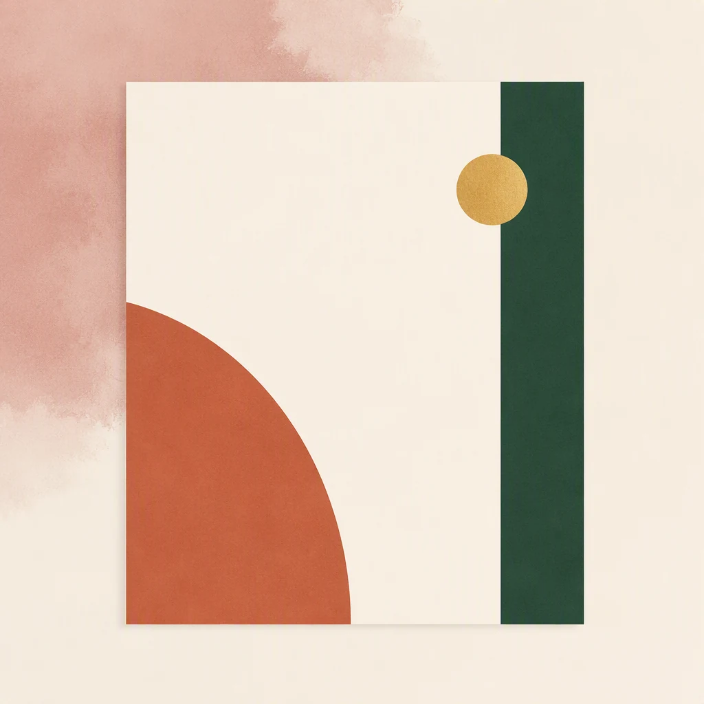
Custom illustration or graphic. One bold graphic — an abstract shape, a sun, a line drawing of the venue — used as the card's single decorative element. One, not several.
The monogram, simplified. A clean geometric monogram (not ornate calligraphy) as the only ornament.
Generous margins. White space on a printed card is the modern luxury. Let the card breathe.
Texture in the paper. Cotton, linen, or recycled stock — the touch of the paper is part of the design. Modern invitations are meant to be held.
Consistent family. The same fonts, palette, and logo across invitation, website, and signage — one modern identity for the whole wedding.
Common Modern Design Mistakes
Modernism without hierarchy. Minimal is not the same as flat. If every element is the same size and weight, the invitation is confusing, not modern. Create clear structure with scale and spacing.
Trend-chasing. A trend (neon gradients, certain font fads) dates an invitation faster than tradition does. Choose timeless-modern over trend-modern: clean layout, strong type, edited palette — these don't expire.
Script cravings. Couples often want "one script touch" — and it instantly undoes the modern look. If you want modern, commit: no script anywhere (save it for a wax seal if you must).
Overcrowding. Modern needs room. An invitation crammed with text, logos, and images can't feel modern, no matter the typeface.
Illegible details. Tiny light-gray type and thin fonts may look chic on screen and vanish in print. Print a physical proof at actual size before ordering in bulk.
Ignoring the envelope. The first modern moment is the envelope — keep it clean too: minimal return address, maybe a modern monogram, no fussy liners unless they serve the design.
Frequently Asked Questions
Are modern invitations appropriate for formal weddings? Yes — "modern" and "formal" aren't opposites. A black-tie wedding with a stark black-and-white invitation in a heavyweight card is both formal and thoroughly modern.
Can we mix modern design with a traditional touch? Deliberately, yes — one traditional element (a wax seal, a linen envelope, a classic wording line) inside an otherwise modern design can be striking. The key is choosing one tradition, not five.
What if our guests are older or less digital? Printed invitations work perfectly with modern design — just keep the essentials in highly legible type and include the website URL in print. Offer a phone RSVP option if needed.
How do we make a digital invitation feel special? Motion, music, and personal video. A 30-second invitation video with your voices and photos is the most personal invitation possible — and entirely modern.
Should invitations match the wedding website? Yes — one palette, one typeface family, one identity across both. The invitation is the first touch of a design that continues on the website, the signage, and the day itself.
Sustainability: The Modern Invitation's Quiet Advantage
Modern design and sustainable choices are natural partners — minimalism is, at heart, the discipline of using less. Your invitation suite is a small but genuine opportunity to reduce waste:
Go digital where it makes sense. A digital invitation uses no paper, ink, or postage — and it's already your most efficient option. For guests who'll reply online anyway, the paper invitation is often a keepsake they don't keep. Digital-first suites aren't just modern; they're the lowest-impact choice available.
Print responsibly when you print. If paper matters to you, choose recycled, cotton, or FSC-certified stock; look for soy-based inks; and work with local printers to cut shipping. These choices are increasingly affordable — quality cotton papers are now standard even at mid-range prices.
Print less, not smaller. The modern minimal suite naturally uses fewer pieces: one card instead of four inserts, because the website carries the details. Every insert you don't print is paper, ink, and postage saved — and the invitation is cleaner for it.
Use the QR code honestly. A QR code to your website replaces the printed directions card, accommodation card, and registry card in one elegant element. It's the modern answer to the insert-stack: one link, everything else digital.
Skip the unnecessary envelope liners and tissue. These traditional extras add waste without adding information. If a material doesn't serve the design or the guest, modern discipline says leave it out.
Plan for the after-life. Most printed invitations end up in the bin eventually — a reality paper suppliers don't advertise. Choosing recyclable materials and minimal components means that when the invitation's moment passes, it leaves the smallest trace. Sustainability is the quiet advantage of modern design: it does more with less, and it says something about you before a single guest reads a word.
Final Thoughts
Modern wedding invitation design is minimalism with personality: bold, well-chosen typography; clean, confident layouts; an edited palette; and quality materials or elegant digital motion. Skip the ornaments and let the type, the space, and your words carry the design. Keep it legible, keep it disciplined, and keep it sounding like you. The result is an invitation that feels completely current today — and that will still look beautifully designed decades from now, because it was built on clarity and intention rather than trends.